Understanding the User

User
Research

Personas

Problem
Statements

User Journey
Maps
User Research
I conducted interviews and created empathy maps to understand the users I am designing for and their needs. A primary user group identified through research was busy students who desire to watch movies but have limited time to pick the perfect movie to watch.
This user group confirmed initial assumptions about the users. However, research also revealed that picking the movie quickly wasn’t always the problem. Sometimes, after selecting the movie, the main problem was that the user found it boring or against their taste and felt they wasted their time.
User pain points

1
Time
Busy students who work part-time jobs often have limited time to invest in picking the perfect movie to watch, or when they do choose the movie, they find it not enjoyable.

Too many choices
People often find it overwhelming to choose among thousands of movies.

Language barrier
Not many platforms that offer similar services include various languages to choose from or translation options.

Accessibility
Platforms for finding movies often do not have assistive technology.
Personas & Problem Statements
I created personas based on the research I conducted (surveys, interviews, and analyzing the behavior patterns of movie watchers).

Problem Statement
Tara is a busy student who needs a fast and easy way to find movies to watch because she has limited time to look for movies.
Problem Statement
Ali is a family man who needs a user-friendly interaction because he is unfamiliar with technology.

User Journey Map
Mapping Tara’s user journey when she would normally choose movies showed how helpful it would be for users to use a dedicated movie finder app.

The Design

Paper
wireframes

Digital
wireframes

Low-fidelity
prototype

Usability
test
Sitemap
First, I sketched out iterations of each screen of the app on paper to make sure that the elements were well-designed and addressed user pain points before moving on to the digital wireframes. I prioritized a clear user flow and navigation.

Wireframes
First, I sketched out iterations of each screen of the app on paper using the Crazy 8 method to make sure that the elements were well-designed and addressed user pain points before moving on to the digital wireframes. I prioritized a clear user flow and navigation. After the paper wireframes, I moved on to digital wireframes and designed screens based on user research findings. Easy navigation was an essential user requirement to address in the designs, in addition to equipping the app to work with assistive technologies.
Low-fidelity Prototype
I used the completed set of digital wireframes to create a low-fidelity prototype. The primary user flow I connected was easily picking a movie to watch by either choosing based on the user's chosen filters or letting AI do the heavy lifting so that the prototype could be used in a usability study.

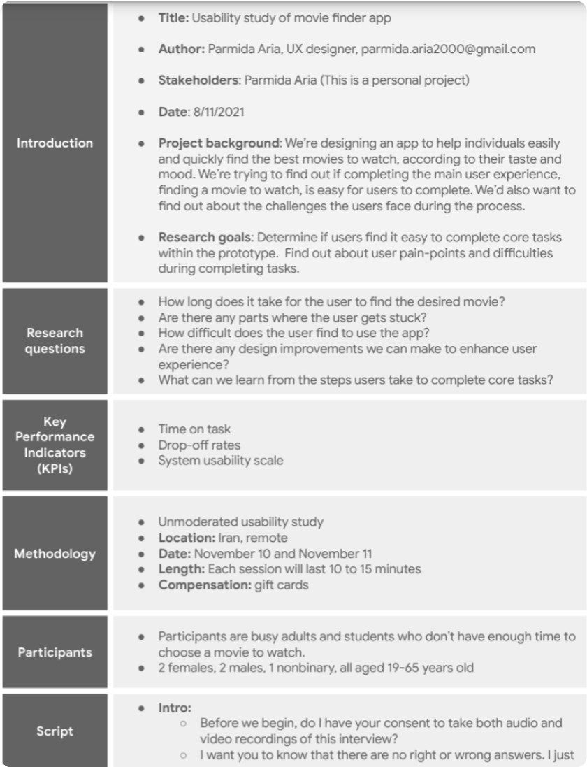
Usability Test
I conducted two rounds of usability studies. Feedback from the first study helped guide the designs from wireframes to mockups. For the second study, I used a high-fidelity prototype and found what needed refining.

Findings
Round 1:

1
Participants struggle with the steps they need to take.
2
Participants aren't clear about whether they landed on the homepage.
3
They want their preferences saved.
Round 2:
1
Users want a wider variety of filters when choosing movie preferences.
2
The homepage layout can be somewhat cluttered.
Redefining the Design

Mockups

High-fidelity
Prototype

Accessibility
Mockups
I refined the designs based on the usability study findings.


.png)